
A web-based platform that ensures a smoother transition for immigrants settling in Ontario.
Research, Ideation, UX/UI, Visual design, Prototyping,
User testing
Berlin Pang, Ben Yihdego, Bianca Fantauzzi, Sophia Stafford, Vansh Bhatia, Vince Robson, Riley Sauer
February - April 2022
Figma, Adobe Illustrator, Photoshop

Problem
The pathway from temporary resident to permanent resident in Canada is both limited and time sensitive.
Many immigrants find it difficult to find suitable communities to settle in, because there is a severe gap in resources for immigrants coming to Canada.
Often, immigrants move to communities where other family members have already settled or choose a "highly desired" city. However, these options are not always the best fit for newcomers to Canada based on their unique requirements and personal circumstances.
How might we build an accessible space for immigrants to explore potential communities and neighbourhoods before moving to Canada?
Solution
NestFinder is a multilingual free-to-use web + mobile app platform that situates necessary housing resources for immigrants in one domain.
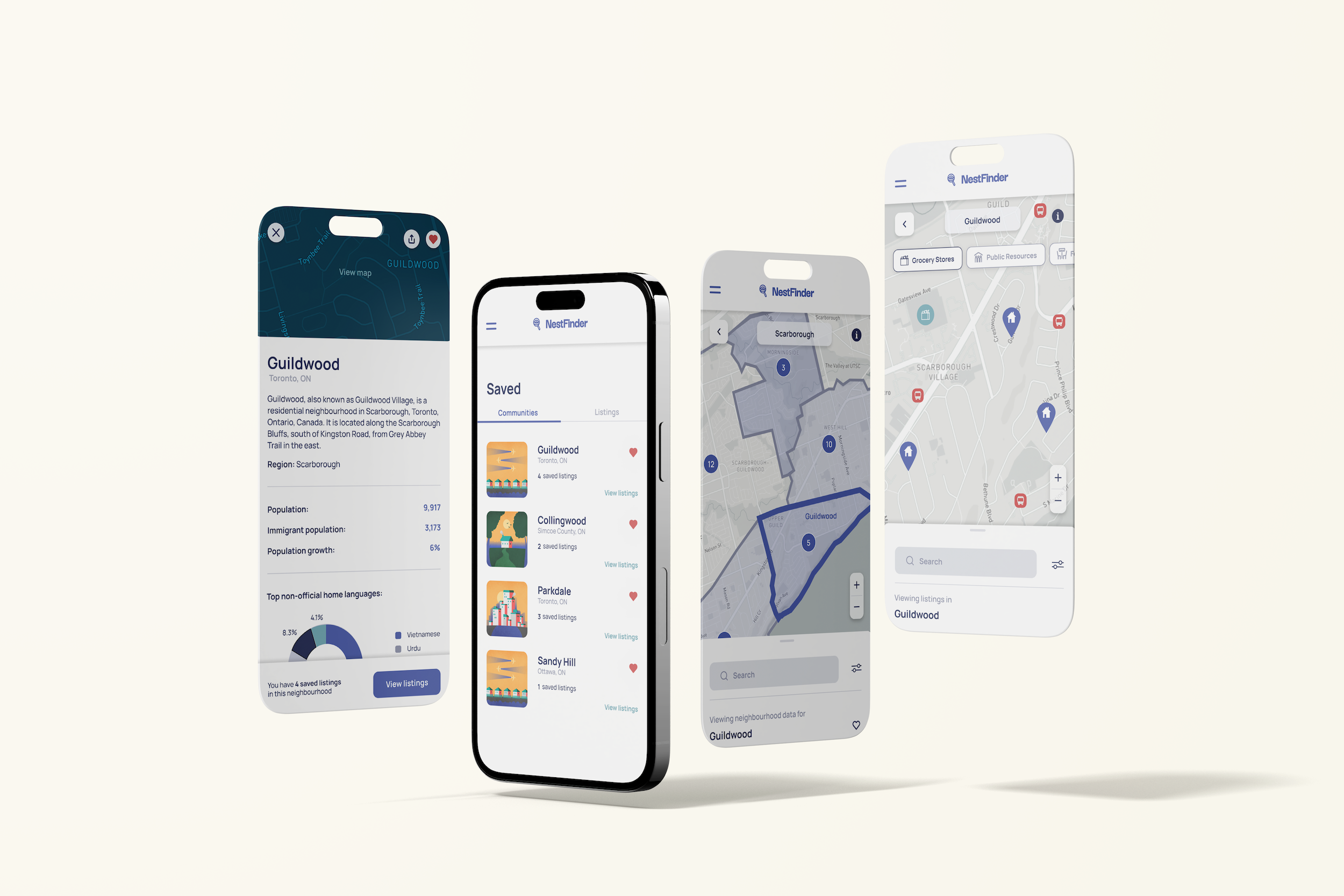
The key features of NestFinder include the ability to simultaneously view housing listings based on user preferences while evaluating its proximity to prayer sites, community centres, schools, international grocery stores, and other amenities they may desire in their chosen region. The platform also features a comprehensive map with multiple view modes to visualize population density of cultural communities, the ability to save and compare listings, adjustable map filters, and tool tips.
Our Approach
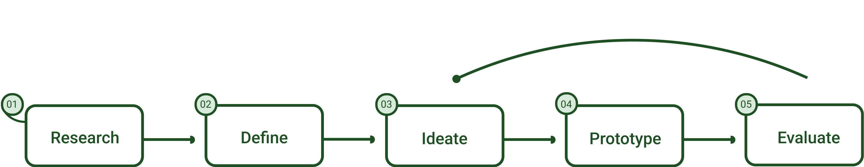
Research: Contextualizing our project, empathizing with users, identifying and understanding the problem
Benchmark Analysis
We began by conducting market research to identify and analyze the existing resources in our product’s market. We found there was opportunity for a centralized database of information regarding housing for immigrants as there were no systems in place to streamline the process of looking for a home before settlement outside of using an agency. Arrive, CanPR, MeetUp, and Rebee were apps available for immigrants, however, focused on job searching, budgeting, immigration processes, social networking, and affordable shopping.
User Surveys
We created multiple open-ended surveys that were sent to potential users that had previously immigrated, were in the process of, and considering immigration. Once we established our place in the market, we conducted user surveys to develop personas and gain general insights about our users.
User Interviews
We spoke to immigrants, immigration workers, and real estate agents to understand more about the immigration housing process. From there we identified user pain points, deconstructed biases, and began researching new streams of information.
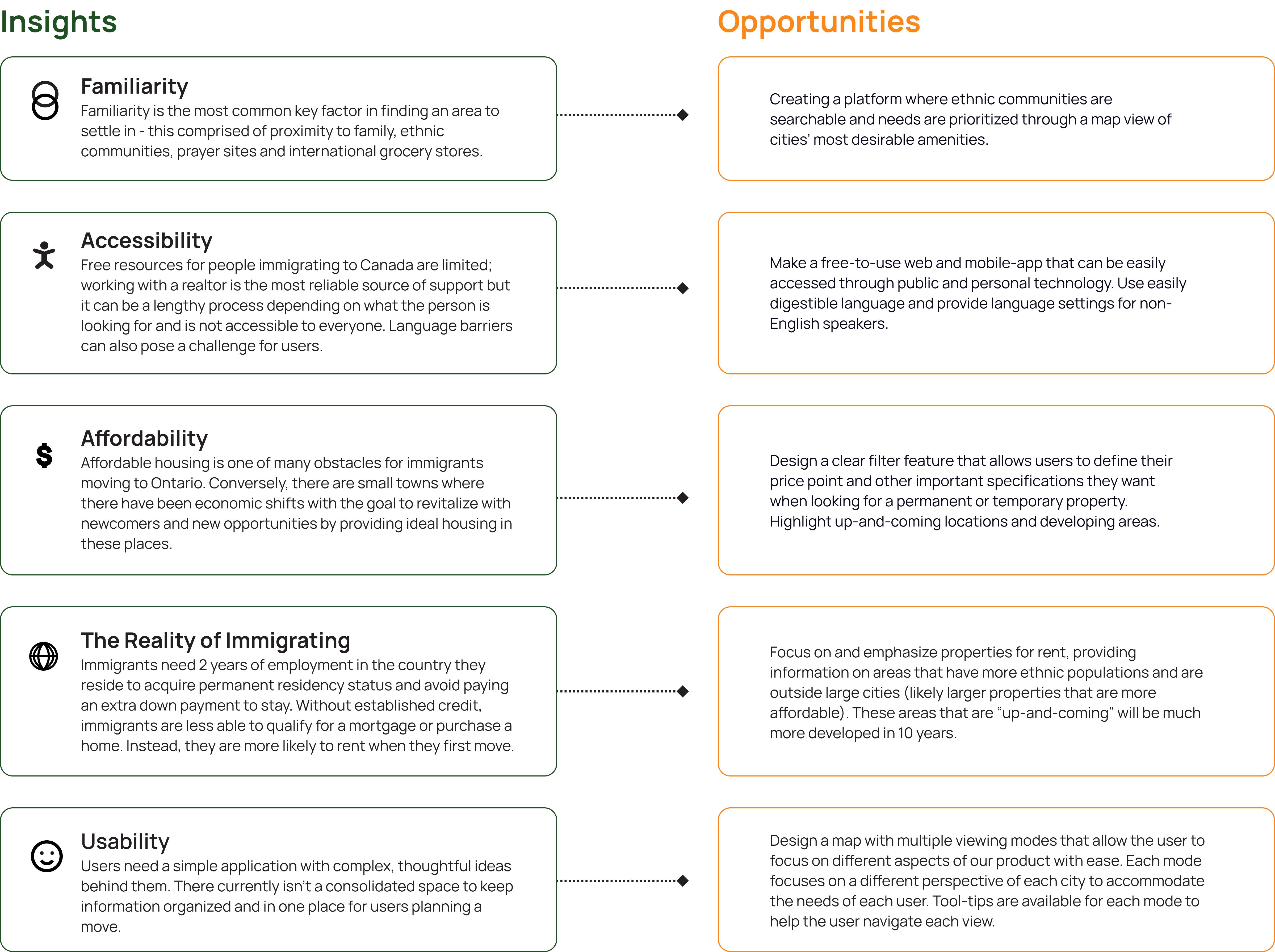
Our team gained 6 key insights from our research, which allowed us to re-design and implement features more suitable for our users. Here are the 6 key insights we gained:
Developing Personas
Our overall findings found that their experiences were impacted heavily depending on if they had family in Canada, and general dependency on family reduced with newer generations of immigrants. We also discovered that newer immigrants were heavily impacted by a lack of accessible ethnic POIs, most prominently, grocery stores and cultural communities. This verified that our service resolves a large pain point with our target market, as newer generations are more likely to utilize our application over other sources of information.
We built two personas based on our data to represent users of different ages and experiences and gain a better sense of our user perspectives.
Ideation: Conceptualizing new ideas and developing our solutions
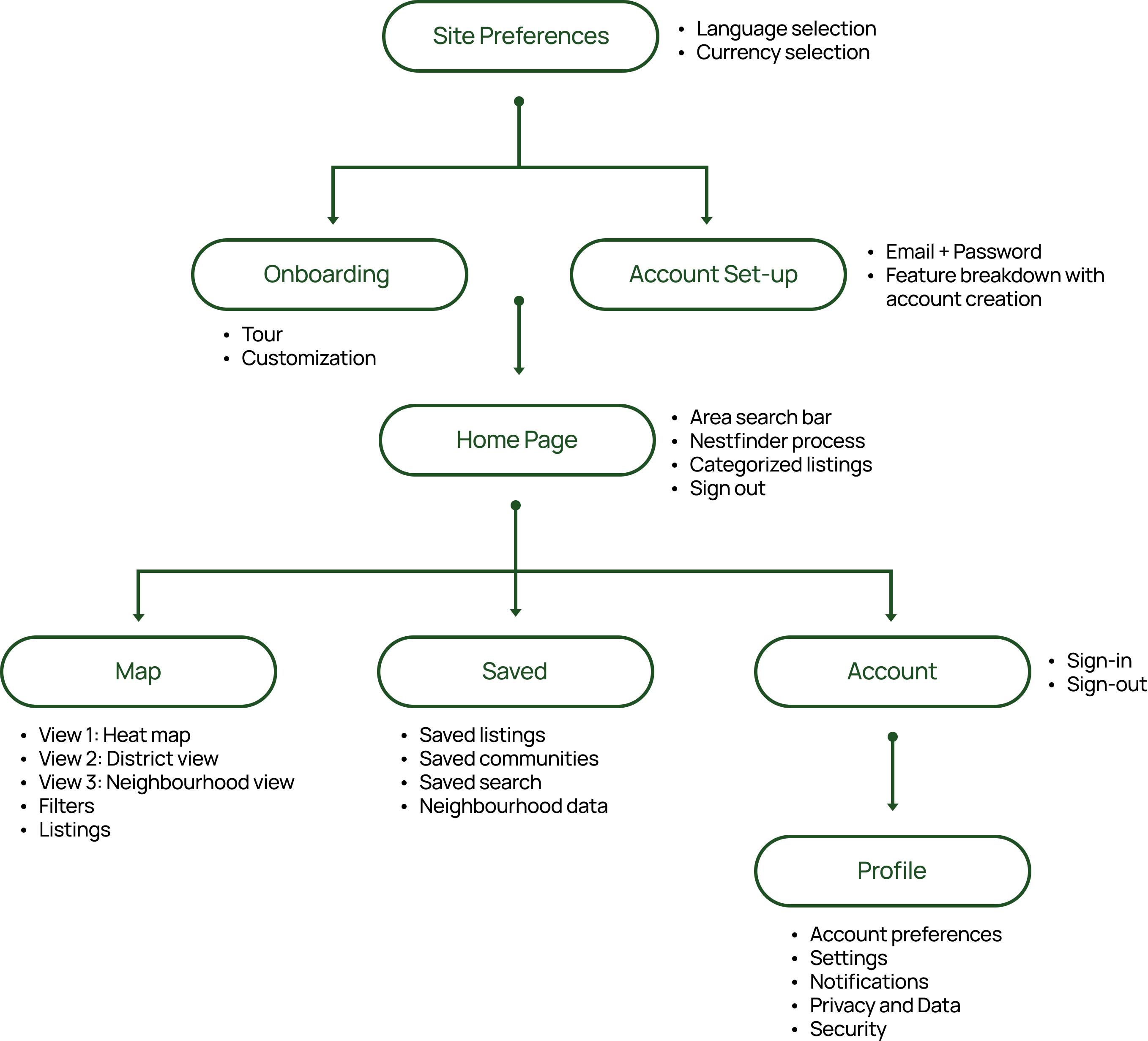
Information Architecture
We began ideating with an OOBE (out-of-box-experience) exercise to help develop a memorable first-time experience for our user. We continued by planning our user flows with sticky notes before realizing that this method was not constructive in this instance because of how complex our UI was becoming. We decided to move onto designing our information architecture in a traditional IA diagram to simplify and define all our requirements successfully.
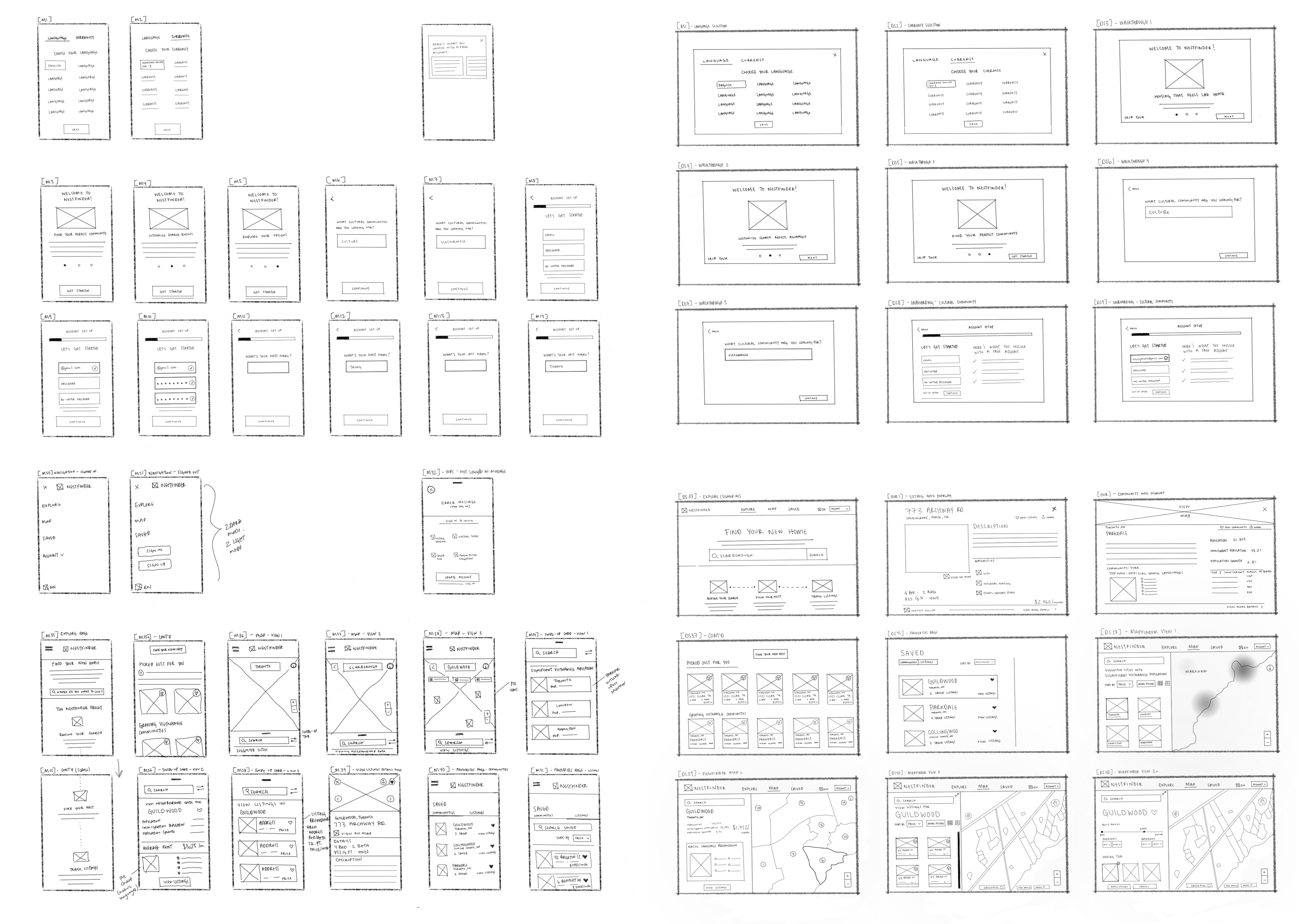
Low-Fidelity
After establishing our platform requirements we sketched low-fidelity screens and layout options. This took multiple iterations to complete, and was subject to change, as we re-designed our main functionalities based on team meetings and professor feedback.
Prototyping: Bringing our concepts and visuals to fruition through simulated screens
Visual Design System
Our team envisioned our brand identity through compartmentalizing some key terms to inspire our visuals, copy, and user flows;
Visuals: Comforting, welcoming, and optimistic
Copy: Friendly and cheerful
User Flows: Attentive, supportive, and reliable
Overall design: Modern, humanist, and effective
We built our design system to streamline our prototyping process and create consistency across our product.
User testing: Making necessary changes to our prototype through user feedback
User Testing
Our team had the opportunity to connect with users and test our product through both remote Zoom and in-person sessions. Through gaining user feedback, we were able to fix errors in our flow and weed out extraneous features of our platform, leaving us with a stronger, more nuanced product.
Based on our user insights, we implemented a series of modifications that addressed each issue. Several changes are listed below:
Onboarding
Simple account set-up beginning with native language selection + quick customization experience for first-time users
Explore Page
Displays NestFinder’s main functionalities, streamlining the housing search process through platform metrics and user preferences
Map: Viewpoint 1 - Heat map
The heat map viewmode is a visual representation of the chosen ethnic population density (based on user preferences) shown through colour in our listed cities
Map: Viewpoint 2 - District View
The district view mode takes the user into a closer view of the city from the previous view focusing on one district of the city. Each neighbourhood within the chosen district is outlined in the map. Here they can view concentrations of ethnic populations based on the shade (the darker the shade the denser the population) of each neighbourhood outline.
The numbers shown in each neighbourhood tell the user how many listings are available. Neighbourhood stats and data are listed on the map to better inform the user of the community
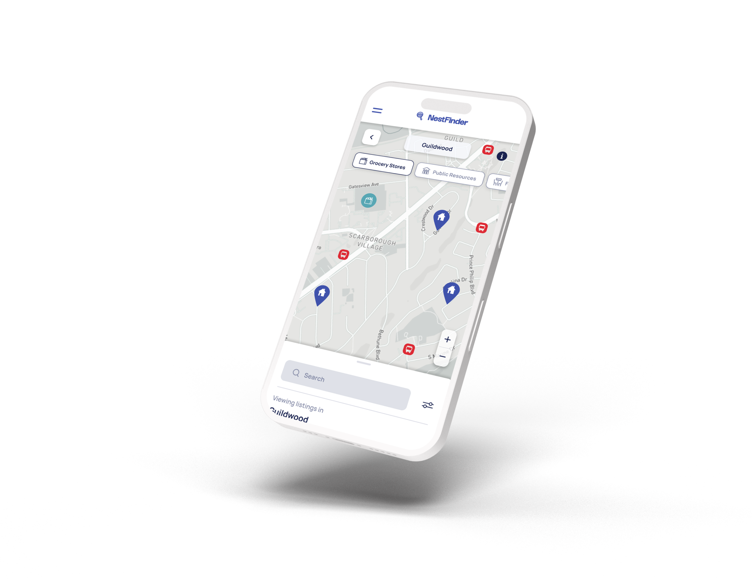
Map: Viewpoint 3 - Neighbourhood View
The neighbourhood view mode displays available listings on the map and highlights the surrounding amenities within each neighbourhood. This includes grocery stores, public transportation, religious centres, schools, etc.
Each point of interest/amenity has a button for users to turn on or off to choose what information they would like displayed on the map
Tool-tips
Displayed as an “I” (information) icon in the top right corner, tool-tips walk the user through map capabilities and how to navigate view modes easily
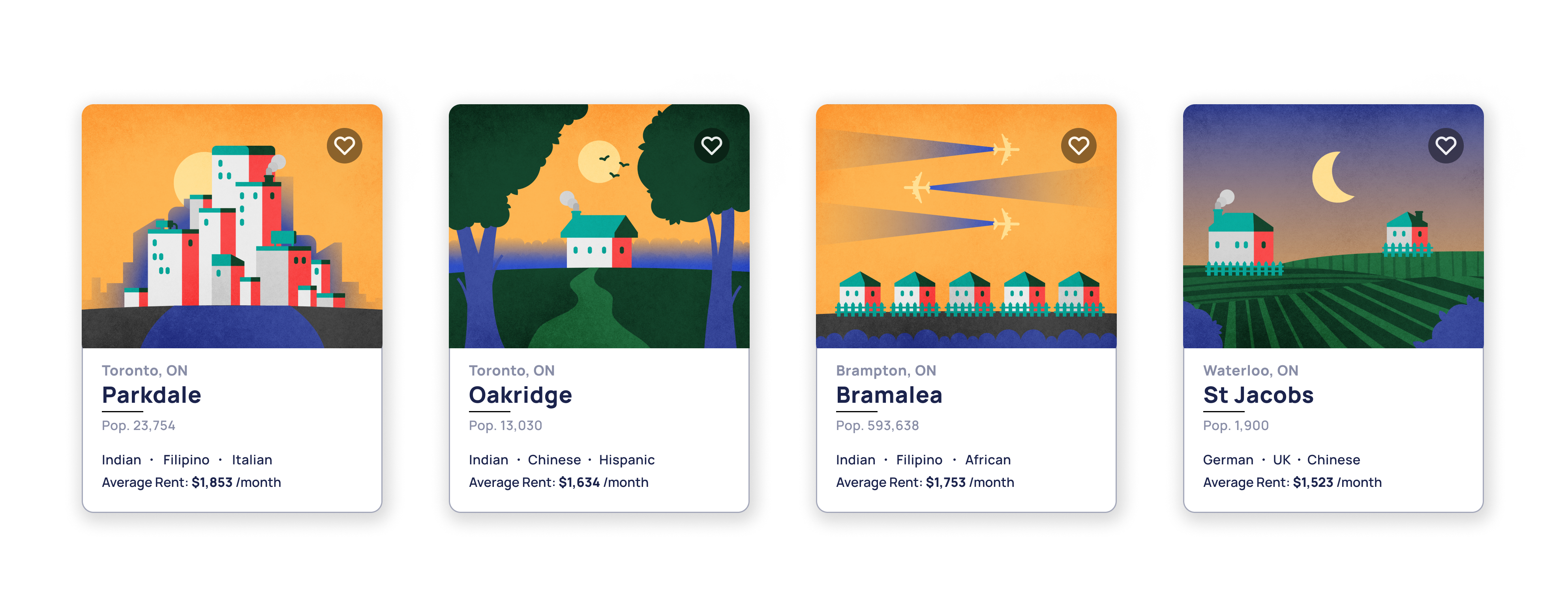
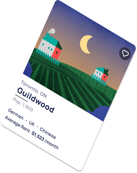
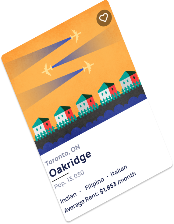
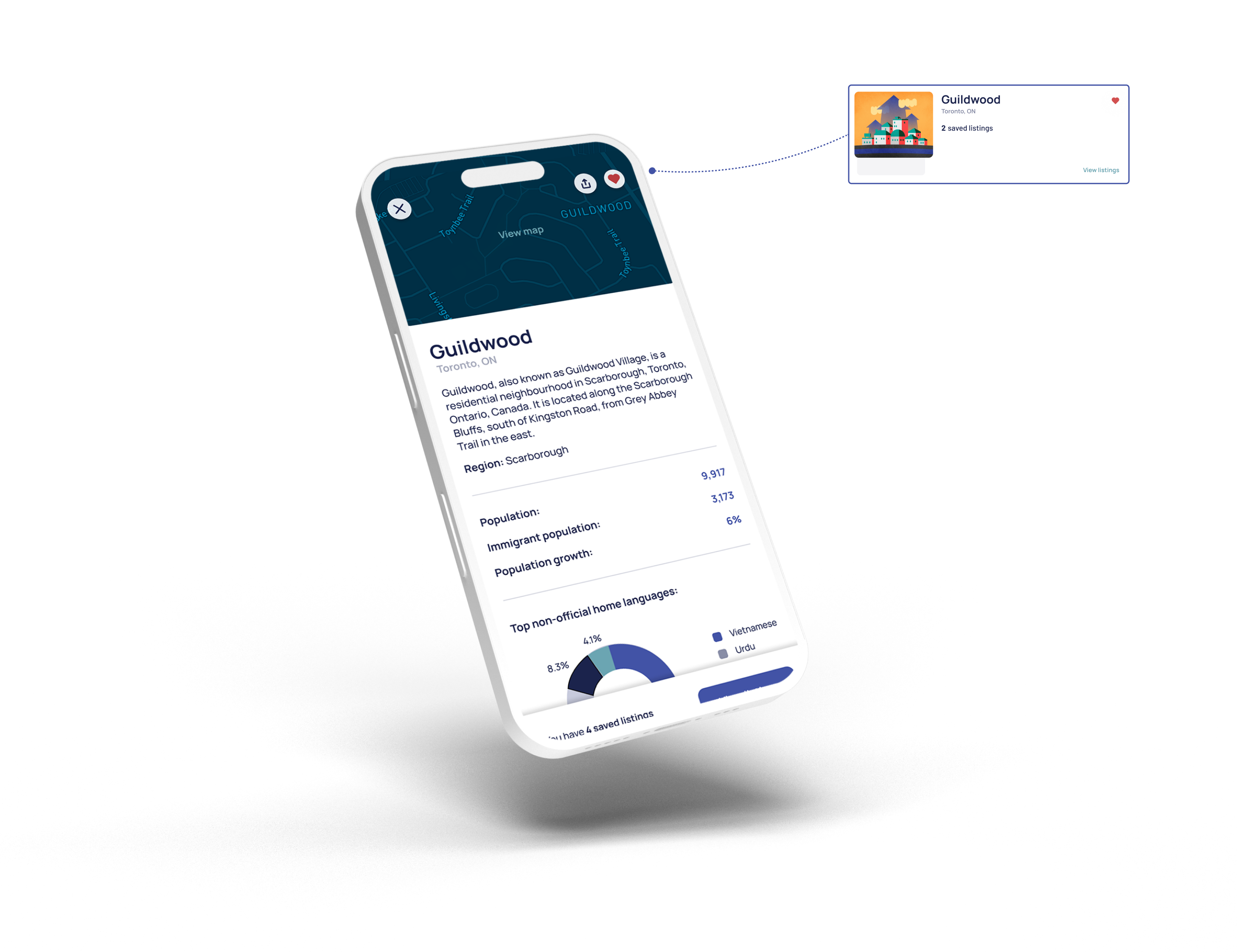
Saved Listings Page
The saved page is where our user’s liked listings are kept. They are organized by both community folders and individual listings, with the option to sort by most recent, price, and community for maximum usability.
The saved page also provides neighbourhood stats in the community folder to help users compare neighbourhoods and learn about the communities
Profile + Settings
NestFinder’s account settings give our users access to their personal information, listing and notification preferences, privacy + data and security controls
Reflection
This project was a great opportunity to work on an extensive project that allowed time for multiple iterations and further exploration into key features. One of my favourite parts of our design process was seeing NestFinder evolve after each user interview and user testing. It was incredible to see the validation of our app’s usability while also making changes that better accommodate our users.
Working with such a large team was a challenge at the beginning when optimizing our design process and making decisions efficiently. Through establishing clear goals for each facet of our product and working with scheduled deadlines, we were able to practice proactive organization. Learning to coordinate priorities within each sub-team was another essential part of our team’s success. This comprised of regular communication between team members and commitment to our product’s vision.
Optimized collaboration allows the opportunity to work efficiently and pivot effectively when developing solutions.